
All multimedia content consists of texts in some form. Even a menu text is accompanied by a single action such as mouse click, keystroke or finger pressed in the monitor (in case of a touch screen). The text in the multimedia is used to communicate information to the user. Proper use of text and words in multimedia presentation will help the content developer to communicate the idea and message to the user.
Words and symbols in any form, spoken or written, are the most common system of communication. They deliver the most widely understood meaning to the greatest number of people. Most academic related text such as journals, e-magazines are available in the Web Browser readable form.
About Fonts and Faces
A typeface is family of graphic characters that usually includes many type sizes and styles. A font is a collection of characters of a single size and style belonging to a particular typeface family. Typical font styles are bold face and italic. Other style attributes such as underlining and outlining of characters, may be added at the users choice.
The size of a text is usually measured in points. One point is approximately 1/72 of an inch i.e. 0.0138. The size of a font does not exactly describe the height or width of its characters. This is because the x-height (the height of lower case character x) of two fonts may differ.
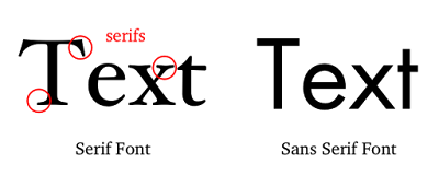
Typefaces of fonts can be described in many ways, but the most common characterization of a typeface is serif and sans serif. The serif is the little decoration at the end of a letter stroke. Times, Times New Roman, Bookman are some fonts which comes under serif category. Arial, Optima, Verdana are some examples of sans serif font. Serif fonts are generally used for body of the text for better readability and sans serif fonts are generally used for headings. The following fonts shows a few categories of serif and sans serif fonts.
Selecting Text fonts
It is a very difficult process to choose the fonts to be used in a multimedia presentation. Following are a few guidelines which help to choose a font in a multimedia presentation.
• As many number of type faces can be used in a single presentation, this concept of using many fonts in a single page is called ransom-note topography.
• For small type, it is advisable to use the most legible font.
• In large size headlines, the kerning (spacing between the letters) can be adjusted
• In text blocks, the leading for the most pleasing line can be adjusted.
• Drop caps and initial caps can be used to accent the words.
• The different effects and colors of a font can be chosen in order to make the text look in a distinct manner.
• Anti aliased can be used to make a text look gentle and blended.
• For special attention to the text the words can be wrapped onto a sphere or bent like a wave.
• Meaningful words and phrases can be used for links and menu items.
• In case of text links(anchors) on web pages the messages can be accented.
The most important text in a web page such as menu can be put in the top 320 pixels.


